Portfolio
Page and Website Layout

Salesforce – Quip How-To Guide
For the cover of a how-to guide to be distributed to Salesforce customers, I created a layout that shared the look and feel of a contemporary advertising campaign that the company was promoting on social media. The campaign used photos of real people interacting with Salesforce’s fanciful Trailblazer characters, and this layout required extensive photo manipulation in Photoshop as well as typographic treatment in InDesign
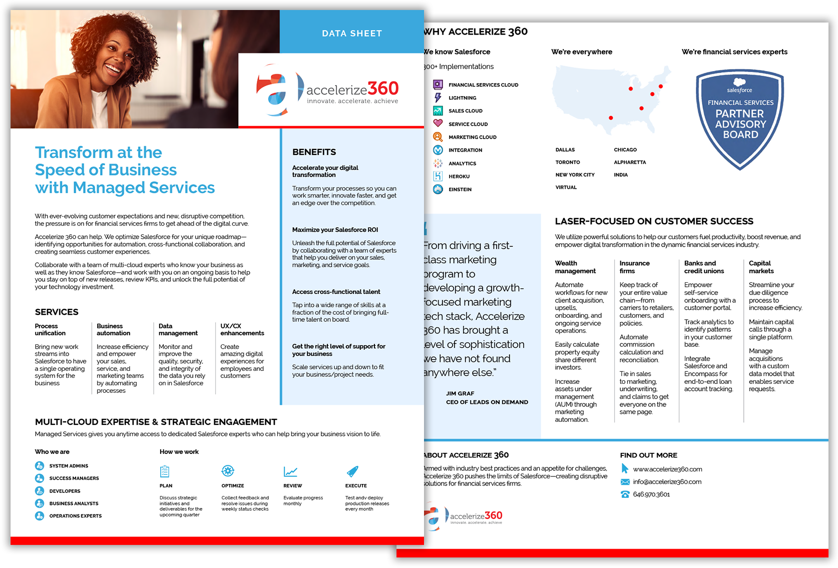
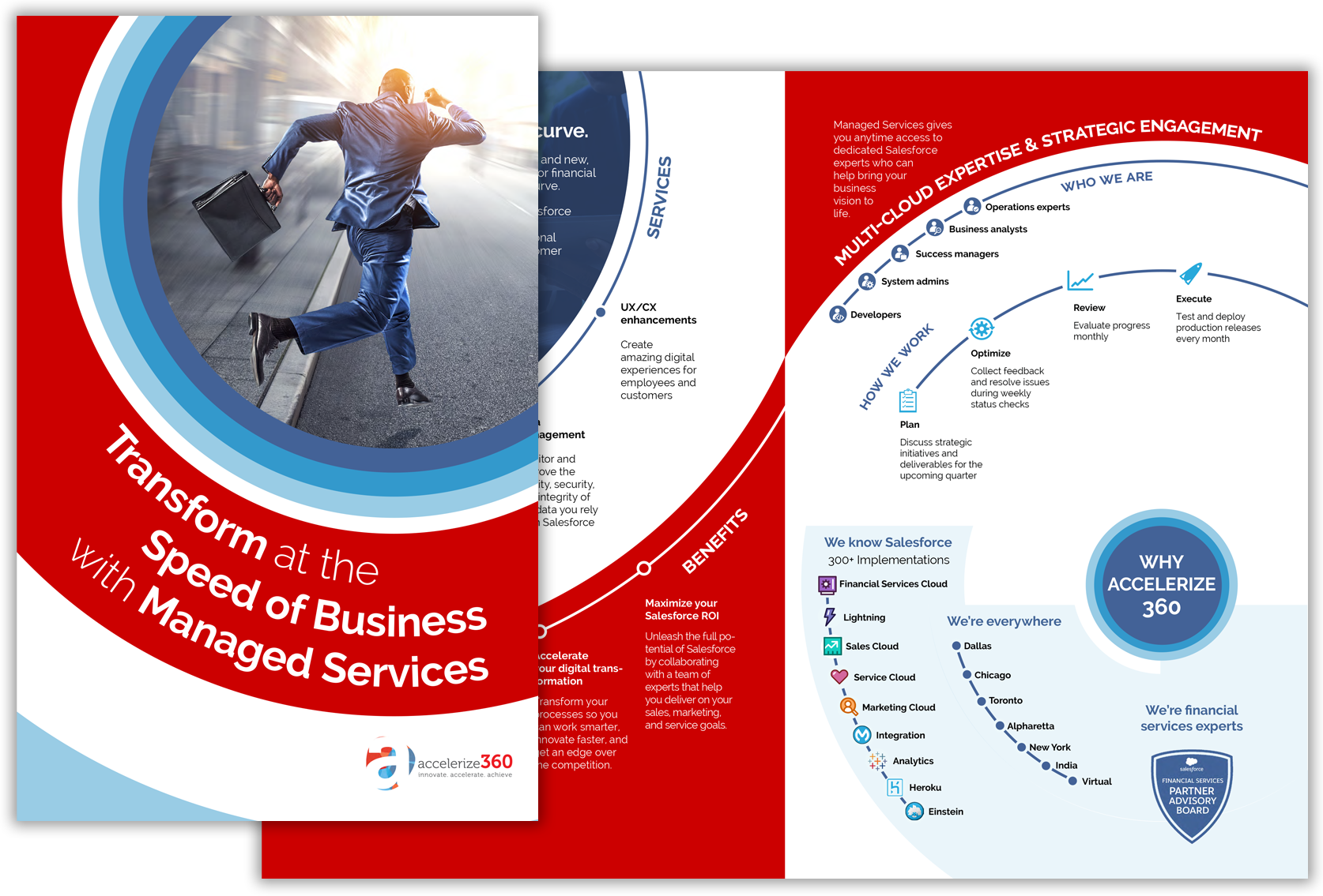
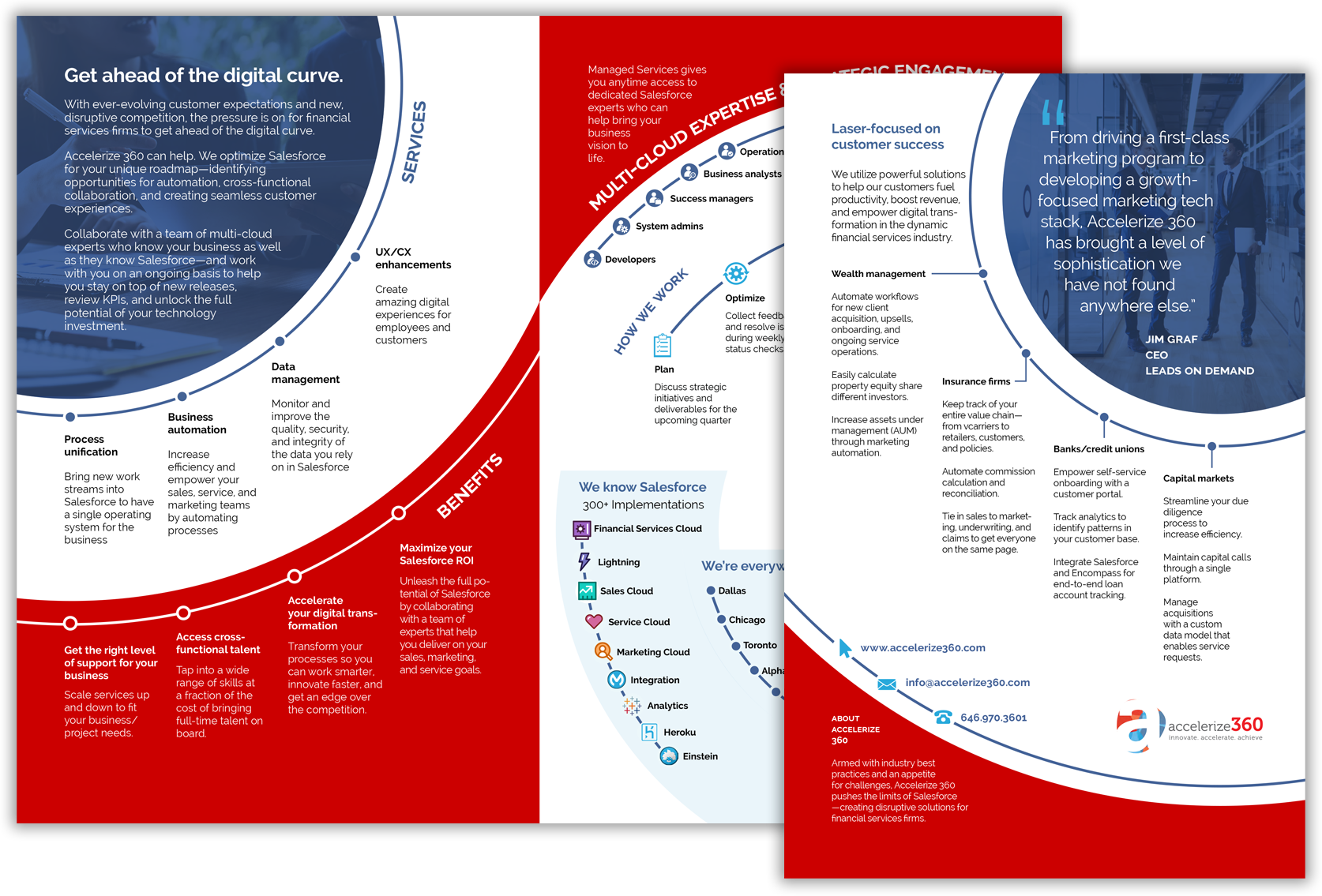
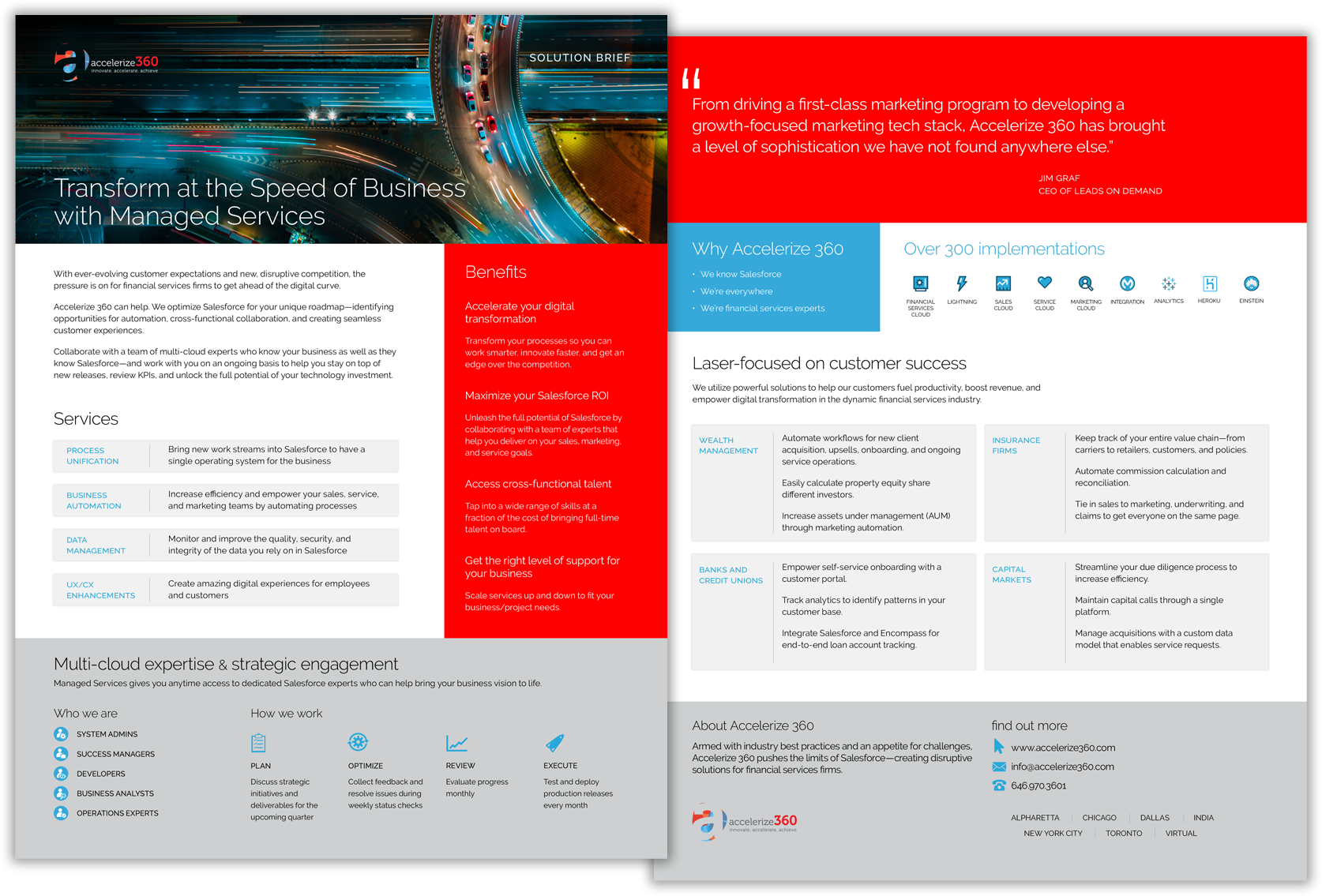
Accelerize360 – Data Sheet
To get the word out about the company’s managed IT service, Accelerize360 needed a solution brief that could be left with prospects after a sales meeting. I first came up with a fairly conventional data sheet layout similar to many that of the company’s peers, but when the client said they wanted something more dynamic, I created an unconventional, eye-catching layout using a dilatational typographic structure. They admired the result but ultimately decided they wanted something a little more conventional yet with areas of bold color, and we arrived at the final design.
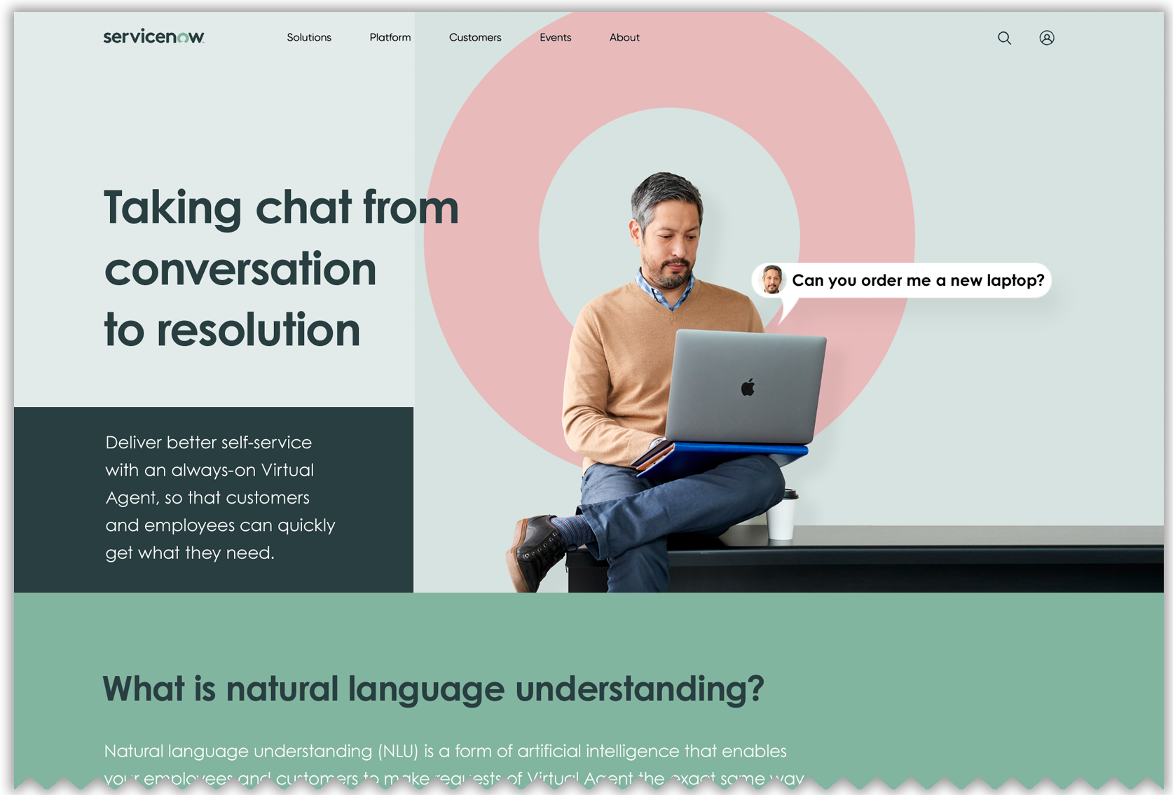
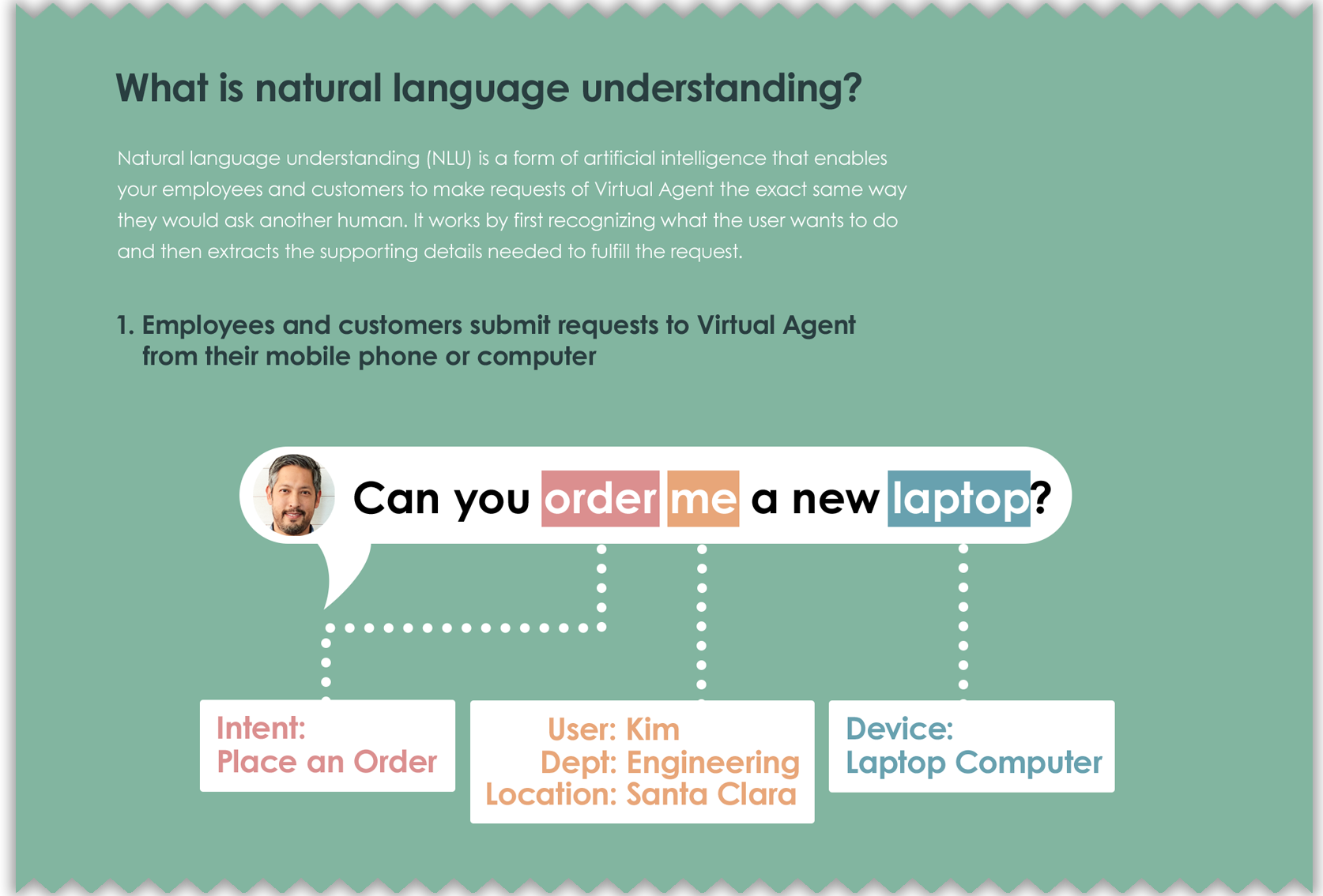

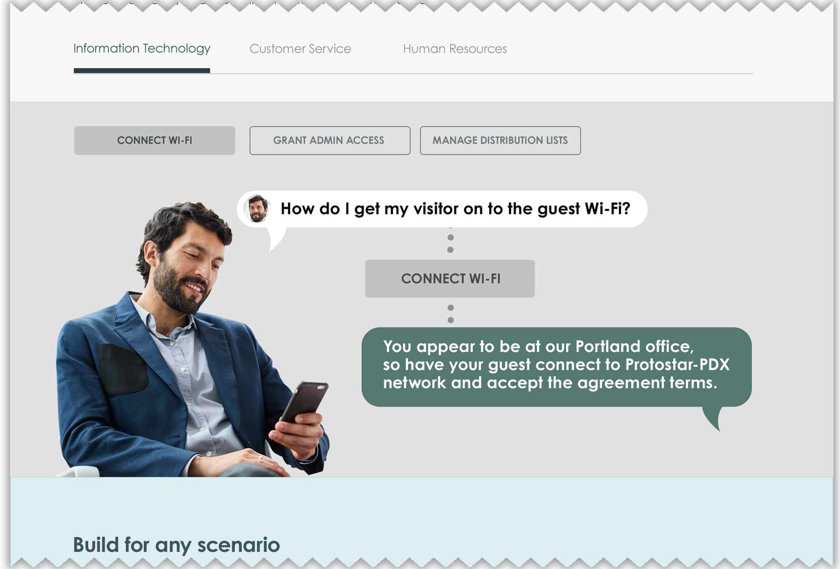
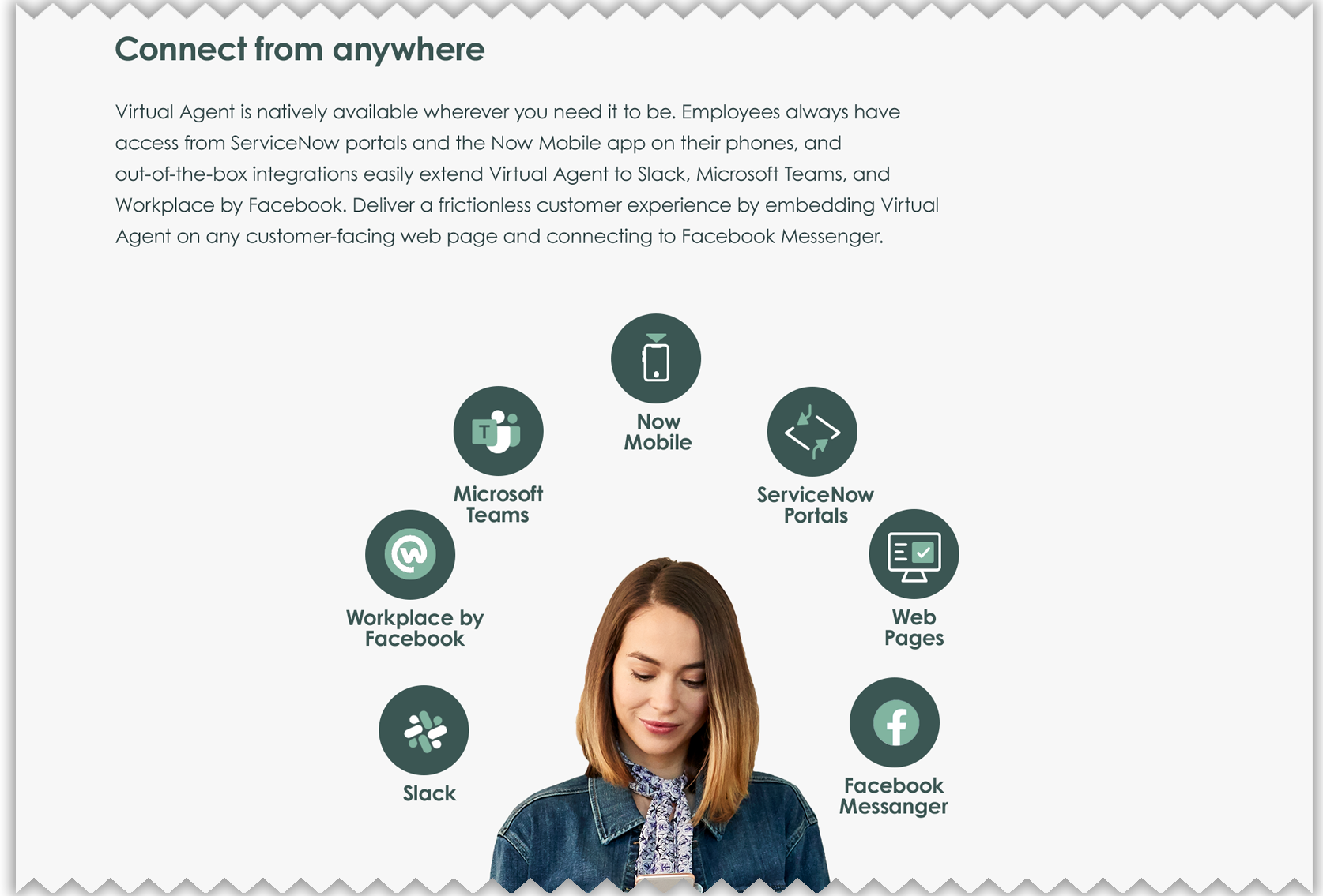
ServiceNow – NLU Website
Tech giant ServiceNow commissioned the design of a website specifically aimed at promoting its new Natural Language Understanding (NLU) product. I created a full-size mock-up of the website—from header to footer—carefully interpreting the company’s brand guidelines to assure a consistent ServiceNow look and feel. Beyond the typical graphical manipulation, this project also involved planning some scrolling-triggered interactivity that was later implemented by the coding team.

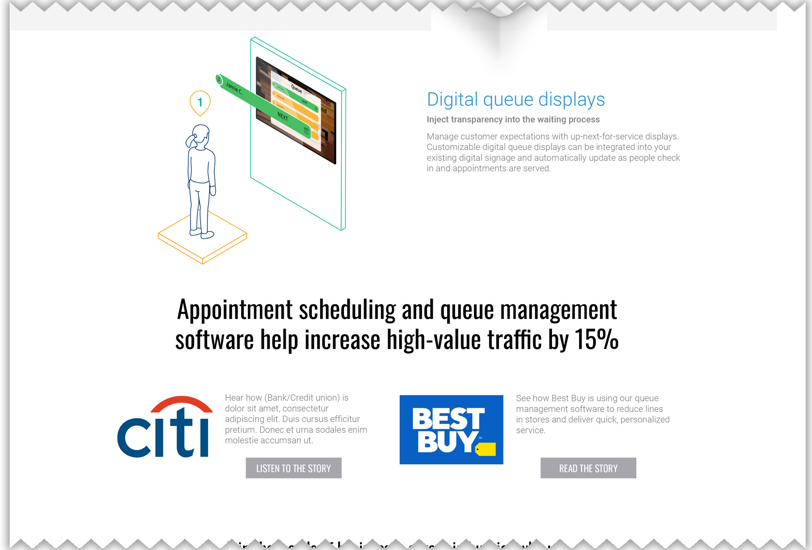
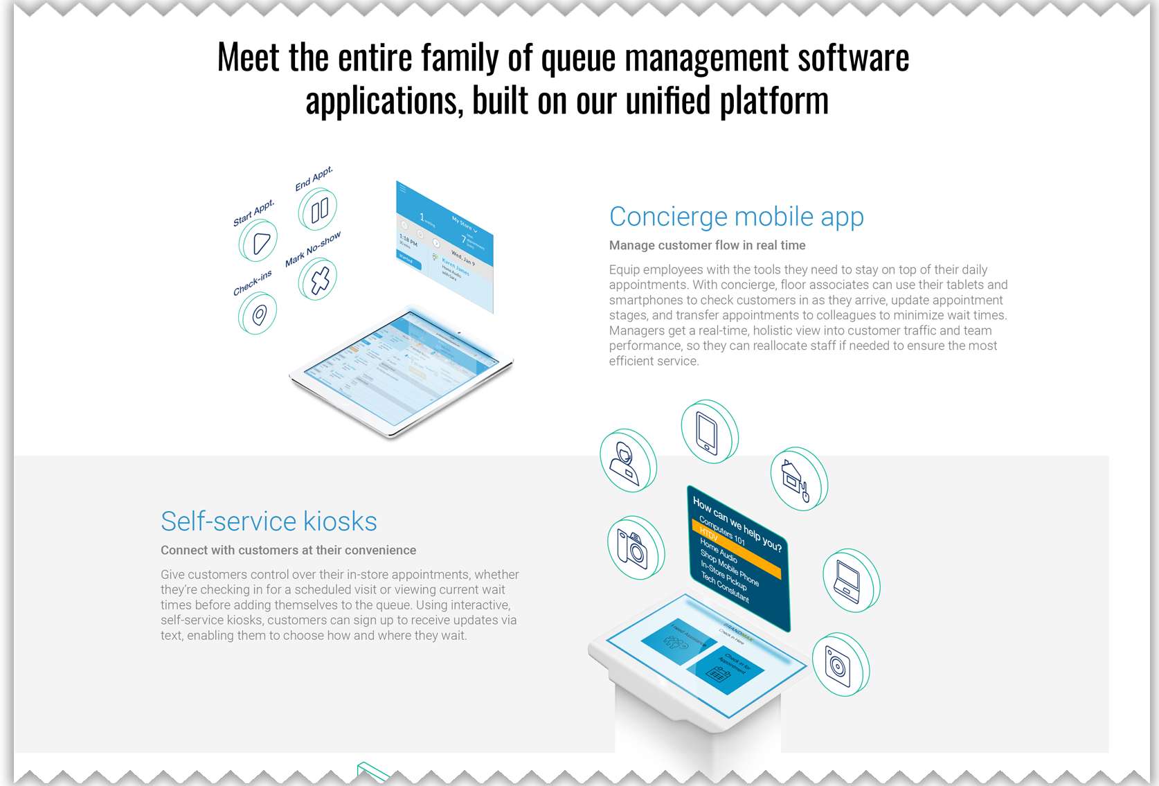
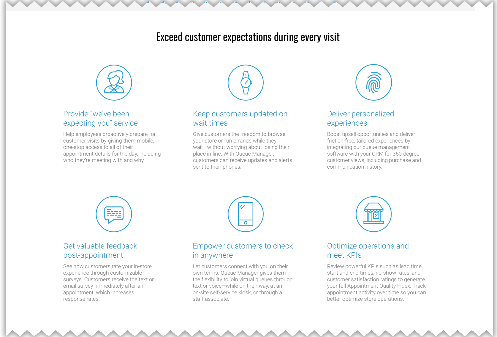
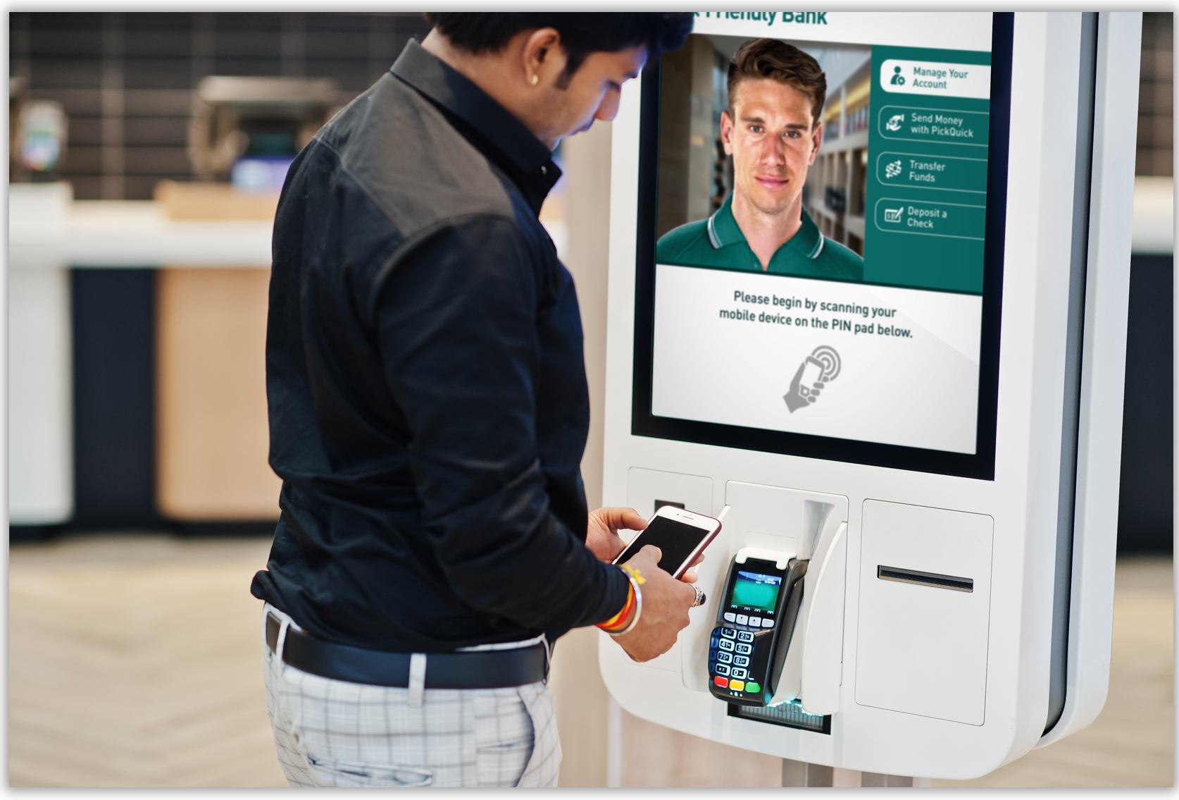
TimeTrade – Website
Scheduling software provider TimeTrade wanted to redesign its public-facing website, and before any HTML coding takes place, the overall interface look and feel is mocked up in as a single image that can be scrolled through—like a working website. In addition to designing the overall layout, I created a family of icons to emphasize key points as well as related conceptual images in an isometric style to show the product in action.
Iconographic Design
Salesforce – Financial Services Icons
Though Salesforce has an extensive library of icons and graphics covering common business concepts and the company’s many products, a specialized team needed a special set of graphics pertaining to specific facets of financial services. Through multiple rounds of negotiation with the client—plus adjustments to the concepts being communicated—we ultimately arrived at final designs.
Photographic Manipulation

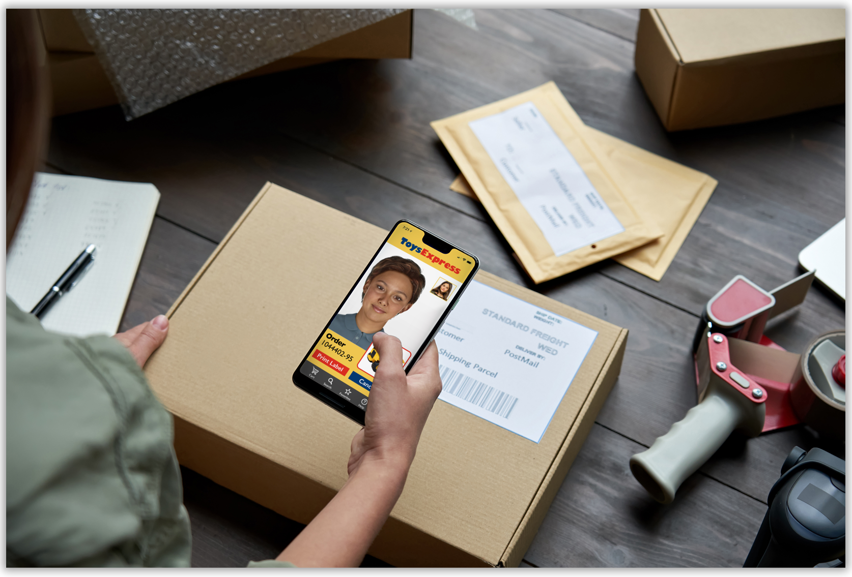
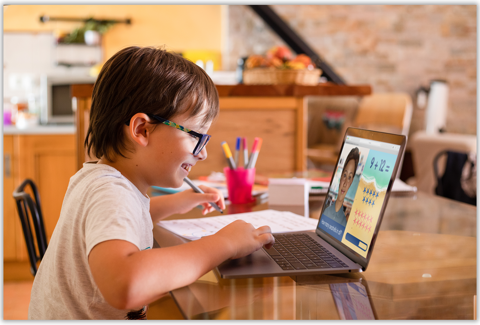
SoulMachines – Context Images
New Zealand-born AI pioneer Soul Machines wanted a collection of images to show its “digital people”—lifelike digital assistants—in use at mall kiosks, on tablets at medical offices, etc. Since those images don’t exist in the real world, I designed realistic interface mock-ups and used photo manipulation to show real humans interacting with the assistants.
Hand-Drawn Illustration
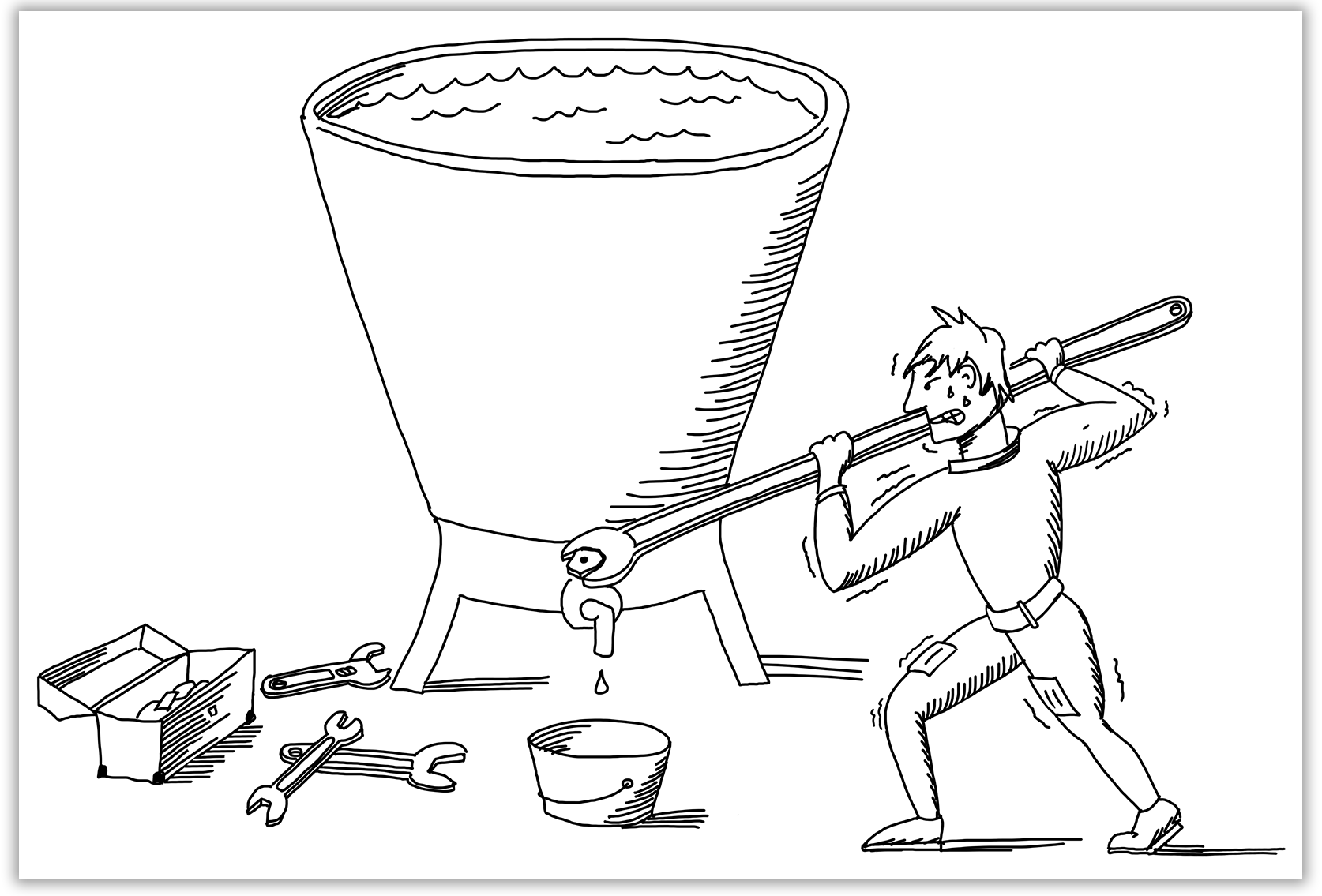
Cisco – Bottleneck Cartoon
Graphic design work for technology marketing is frequently a repetitive stream of producing antiseptic PowerPoint presentations and slick motion graphics, so unusual client requests can sometimes offer a welcome change of pace. In this case, a marketing executive at Cisco wanted a hand-drawn cartoon depicting the visceral feeling of frustration network professionals feel when they have an an abundance of data to move but can barely get any throughput through antiquated networking technology—similar to a stuck valve holding back a deluge of water.
Presentation Design
Experian – All-Hands
For an important all-hands meeting, global business intelligence firm Experian wanted compelling graphics to show how the company was set to expand beyond the massive “tier one” companies it traditionally served to encompass companies of all sizes—all over the world. To provide much more engaging graphics than what is typically possible in presentation software such as PowerPoint, I created animation sequences in Apple Motion that blended seamlessly with the rest of the presentation.
ServiceNow – Apple Promotional Presentation
In its bid to expand ServiceNow’s relationship with Apple, the company’s Top Accounts team turned to BayCreative to create a top-notch presentation worthy of Apple’s discriminating design eye. One key point in the presentation was showing the expanse of ServiceNow’s product portfolio, and I created a tree-like graphic showing that the full menu was over twice as large as Apple’s current selection of services. The transition to future roadmap of those services was eased by a clever animation, and the roadmap itself presented on an iPad Pro—a device certainly familiar to the Apple audience.
ServiceNow – Amazon Care Presentation
Amazon’s fledgling Care subsidiary was founded to promote a patient-centered model of care, and in pitching a suite of ServiceNow products, the top accounts team wanted to show how ServiceNow would support that goal. Fittingly, I crafted a slide design that contrasted a chaotic present with an organized and patient-centric future, with sweeping animations adding drama to the transformation.
Motion Graphics Design
Hazelcast – Platform Explainer
Technology company Hazelcast already had an established brand style when it approached BayCreative to create a video to explain its platform, but the company’s well-defined look had never before taken kinetic form. After sketching detailed storyboards of planned on-screen action, I brought the Hazelcast brand to life with motion. Using the company’s grid of interlocking astroids to contain video clips within their negative spaces, I employed the brand’s aqua backlights to symbolize activity and interconnectivity—culminating in the Hazelcast logo at the conclusion.
Cisco – University Recruiting
Competition for top tech talent is intense, and Cisco wanted to differentiate itself from other potential employers by showing new graduates the impact they could make by coming to work for the networking titan. Using the company’s color palette and style of iconography, I showed how Cisco technology is omnipresent at every level of the Internet and how it’s the people behind the technology who bring it all to life.
ServiceNow – Presentation Opener
To cut through the noise and really grab an audience’s attention, many executives like to open their keynote addresses with an eye-catching video. For this project, a ServiceNow exec wanted to show how the close cooperation of between the company’s highly skilled team members, innovating in the moment, was like interplay of highly skilled jazz musicians. Using only the simple shapes and limited color palette of ServiceNow’s brand, I created a vibrant abstract animation evocative of the jazz soundtrack’s midcentury milieu.
Character Design and Animation
TrackMyShuttle – Brand Animation
Software startup TrackMyShuttle wanted an animated video to dramatize how the company’s product could avoid guests’ frustrations over not knowing where their hotels’ airport shuttles are. Beginning with the limited selection of simple line art imagery on the company’s website, I expanded that clean style to include an emotive customer character and hotel employees, and built a miniature world of settings—airport, city street, shuttle bus, hotel—as a backdrop.
Twitter – Super Twizzles Video
To boost the morale of employees tasked with policing abuses of its platform, Twitter commissioned an elaborate animated production casting these moderators as superheroes. I designed a cadre of “Super Twizzle” characters, each exemplifying one of the moderators’ positive qualities, plus a hooded “bad actor” villain, and anthropomorphized “tweet” characters. Additionally, I created the all of the piece’s background artwork and worked in conjunction with an assistant to produce the animations.
Palo Alto Networks – Cookie and Bug
Since most developers are receptive to in-jokes about the world of technology, Palo Alto Networks sought a comedic and indirect path to promoting its development tools. Tasked with creating an Adult Swim-like wry cartoon for programmers, I created the crude-looking characters Cookie and Bug—plus their clueless, stone-faced boss. After sketching storyboards and negotiating several rounds of edits with the clients, I animated the characters against a contrasting and surreal backdrop of photomontages crafted from manipulated images.